Why and how we use Tailwind CSS
In this article we are going to give an overview of Tailwind CSS, highlight the most important features for us at 1xINTERNET, and explain why we choose it as our standard CSS framework. Tailwind CSS plays nicely with Drupal, Symfony, Twig, as well as with ReactJS and Web Components. We show how we achieved an optimal fit between the technologies and provide coding examples.
What is Tailwind CSS?
Tailwind is a CSS framework, a styling tool that boosts the development speed of the user interface and improves the consistency of the theming process.
Rather than providing designed components in a specific style like many other UI frameworks, Tailwind CSS provides low-level utility classes that can be customised and extended to match the client needs and the designer's creativity.
This approach gives flexibility and control while making it easier to maintain consistency.
Tailwind CSS enables us to unify and standardise the styling process of any website or application, making development faster and the UI more consistent.
Why Tailwind CSS?
Overall, Tailwind CSS is a flexible and efficient tool. The utility-first approach and facilities that it provides to build customisable and reusable design systems save us time and effort during the development process, while also helping to maintain a consistent and responsive design.
Utility First Approach
Tailwind is a utility-first CSS framework, which means that it is focused on making the styling process faster and more understandable.
As previously mentioned, rather than providing a set of predefined styles or components, Tailwind provides a set of utility classes, with meaningful names, that you can customise or extend and then use in order to build and personalise the elements that will compose the user interface.
This allows for greater customisation, designers can be more creative while establishing consistent design principles and developers can quickly apply the classes and fine tune details in order to match the design.
The result is that the client gets a more personalised and representative look and feel in less time and the developer’s speed is boosted.
The main point of the utility classes is to be understandable and representative, instead of inventing naming conventions for the classes the result of applying them is included in the name.
Some examples are:
bg-white // bg means background and “white” is the colour
p-3 // p means padding
m-3 // m means margin and “3” the amount applied
Additionally, you can apply these classes conditionally, depending on the screen size, the theme of the user or what the cursor is doing (hovering, focusing …).
Some examples are:
dark:bg-black // dark: will only apply when on dark mode
sm:p-3 // sm: will only apply for mobile screensize
hover:text-red // hover: will only apply when hovering
With Tailwind we can use utility classes, which translate into making our styling method more legible, agile, consistent, creative, representative.
Define a design system
Tailwind config file provides a single point of truth for the foundation of our styling and theming process.
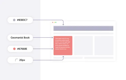
We can customise the Tailwind predefined styles or extend them adding colours, spacings, animations, etc.
This way we define the whole foundation of the look and feel of the website in a single place where we can quickly check, maintain and fix.
Designers will also be closer to the actual implementation of their ideas, they could even change the design tokens themselves easily by checking the configuration. So, the designer-developer relationship is improved making the configuration file a styling agreement between them.
As an example:
module.exports = {
    content: ['./src/**/*.{html,js}'],
    theme: {
        colors: {
            'brand': '#1fb6ff',
            'secondary': '#7e5bef',
        },
        fontFamily: {
            sans: ['Graphik', 'sans-serif'],
            serif: ['Merriweather', 'serif'],
        },
        extend: {
            spacing: {
                '8xl': '96rem',
                '9xl': '128rem',
            },
        }
    },
}
We can see the content where Tailwind classes are being used, how colours and font-family are overridden, and the spacings are extended.
With Tailwind we only need to maintain a single point of truth with the foundation of all the styles of the project which translates into consistency.
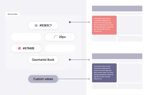
Do not feel constrained
Tailwind best practices promote using the config as the primary source of truth but that doesn’t mean that you cannot update it or use some custom values for a unique design that your favourite pixel perfectionist designer provided.
As an example:
p-[22px] // will apply 22px of padding
w-[calc(100%-20px)] // will apply the calculated width
With Tailwind we can configure the foundation but still use custom values for elements that differ from the defined standards, which translates into flexibility and freedom.
Do it once, then reuse it
Tailwind plugins let you encapsulate complex styles into custom utility classes, later you can import those plugins or existing ones in any project so you will have all of them working out of the box.
For example:
const plugin = require('tailwindcss/plugin') module.exports = {
    plugins: [plugin(function({
        addComponents
    }) {
        addComponents({
            '.btn-demo': {
                padding: '.5rem 1rem',
                borderRadius: '.25rem',
                fontWeight: '600',
            },
            '.btn-demo-blue': {
                backgroundColor: '#3490dc',
                color: '#fff',
            },
            '.btn-demo-red': {
                backgroundColor: '#e3342f',
                color: '#fff',
            },
        })
    })]
}
Additionally, Tailwind presets let you export and reuse a whole configuration file of Tailwind. We can easily define a base theme or config that will include lots of features and maintain it separated from the custom configuration of any specific project that will use it.
With Tailwind we can reuse encapsulated style features using plugins or whole configurations using presets, which translates into reusability and modularity.
Reduce size and ensure performance
Tailwind provides different “ready for production” methods of building and minifying the styles.
For example we can purge all the classes that we have in our config (including the predefined Tailwind classes) if they are not being used in our templates.
We can also use the “jit” mode that stands for “just in time”. With this mode Tailwind will generate the CSS just when it’s needed.
These methods reduce the amount of CSS that our project uses which means that the website or application will be lighter and the load time will be faster.
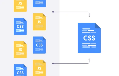
With Tailwind we can reduce the amount of style files generated, which translates into less load time and better performance.
Remind yourself about best practices
Tailwind styling approach can lead to repeated code and styles, and this will stand out easily to the developer so, when repeating a style structure many times, you are being warned that it should be moved to a layout or feature component where these can be unified and reused.
This way developers are encouraged to follow principles as DRY (Do not Repeat Yourself), separation of concerns and modularity.
Something similar happens when you are writing dozens of classes in the same element, the monster styled element is probably meaning that you should find a better markup structure to get to the same result.
With Tailwind we have clearer hints when we are not following the best practices building the markup structures of our systems.
Open source
Tailwind is an open source project, which means that its source code is freely available for anyone to use, modify, distribute and more importantly improve.
What are the benefits of Tailwind being open source?
Collaboration
Being open-source allows anyone to contribute to the development of Tailwind CSS.
This can result in a stronger and more robust framework as more people contribute documentation, ideas, code and bug fixes.
Transparency
Open-source software is typically developed in a transparent manner, which means that anyone can see how the software is built and how it works.
This can be useful for developers who want to understand the inner workings of Tailwind CSS and how to customise it to meet their needs.
Flexibility
Being open-source allows developers to modify the source code of Tailwind CSS to suit their specific needs.
This can be useful for projects that require custom styles or functionality that is not provided by the default framework.
Extensions and tools
Tailwind can be hard to use if you do not prepare your IDE and extensions accordingly.
Some of the problems are, for example, that the developer needs to remember the new utility classes, that the code can increase its size due to large “inline class styles”, or sorting the classes we use.

The good news is that there are tons of extensions available in order to enable code autocompletion, hiding long inline classes, or sorting the Tailwind classes.
Is Tailwind above other CSS frameworks?
The choice of a CSS framework depends on specific needs and goals of the project.
There are certain features and characteristics of Tailwind CSS that may make it a better fit for certain projects compared to other frameworks.
So, why choose Tailwind and not other CSS frameworks?
The utility-first approach, customization, performance, consistency and ease of use are translated into faster development speed, theme robustness, better brand representation and smoother website.
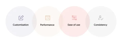
Customisation
As mentioned previously, Tailwind CSS allows for a high degree of customization, which means that you can create your own styles or override the default styles to meet the specific needs of your project.
This can be useful for developers who want more control over the look and feel of their projects and want to fine-tune the styles to match their design requirements.
Performance
Tailwind CSS generates a minimal amount of CSS, which can improve the performance of the website. In the company of postprocessors like PostCSS we can reduce the amount of CSS generated and with the JIT mode we can process only the classes we are using.
Ease of use
Tailwind CSS is easy to use, even for developers who are not focused on the frontend and styling part of the websites. It provides clear documentation and a simple syntax for applying meaningful utility classes to the markup, which makes it easier for developers to apply changes and reduce the style code needed while trusting that the configuration is going to ensure consistency.
Consistency
By using a consistent set of utility classes, developers can ensure that the styles applied to different elements in a project are consistent and follow the same design principles. This can make it easier for clients to understand the design choices and provide feedback.
Other frameworks can provide faster development with less customisation (component based), or the same customisation but with worse performance and less consistency.
How do we use it in 1xINTERNET?
Our technical stack in the frontend consists of the following technologies:
- Drupal's theme layer using Twig
- ReactJS apps both as single page applications and as embedded webapps
- Web Components for creating reusable elements for arbitrary frontend technologies and design systems
In most of our frontends all technologies are present. A typical web based project would have a traditional frontend using Drupal's theming layer, but all interactive elements of the website would be built with ReactJS. For many projects this is an optimal setup.
Read more about why pairing Drupal´s frontend technology with ReactJS is a good choice
The shared elements in Twig and React are built using Web Components. Examples of shared elements are buttons, cards, tabs, lists, etc. To make reviewing of shared elements easy we build them as a design system.
We use Tailwind CSS for all technologies and share the configuration. As a result, a design change implemented in Tailwind CSS is immediately applied to all Web Components, all Twig templates, and all React webapps on a website.
For our developers this approach makes applying changes to a frontend a lot easier. They can easily understand the styling process for all technologies. The same is true for different projects. Developers can collaborate across projects, because we try to reuse our frontend technologies as much as possible.
Digital Experience Platform (DXP)
Our main solution, DXP, is a web platform that we use for all projects. It consists of a Drupal content management system with a ready-made theming layer using Web Components.
It comes with an integrated design system which is readily setup to work with Figma. Both the theming layer and the Web Components library are built with Tailwind CSS.
Client projects
Most of the projects we implement are based on our DXP solution, therefore, they all start from our Tailwind preset foundations and Quartz as Design System.
Later we easily adapt our starting point to the client needs, making our styling system a standard in our projects which translates into development performance, consistency, robust results and grounded bases for every project.
From our developers
"Being able to write plugins, which generate custom utility classes, is something I did not have in other frameworks I’ve used, and I find it is very useful.
It’s much quicker to write CSS with utility classes, once you can remember them".
John Durance, Full Stack Developer at 1xINTERNET
"I especially like it in combination with PostCSS that dumps all Tailwind CSS from the result.css that are not used in the project and keeps the result.css file as small as possible.
Having a tailwind.config.js where you can simply configure EVERYTHING in one single place by either customising the defaults or adding new defaults is a huge time saver.
I always thought that having lots of utility classes in your markup makes it unreadable but the opposite is true: I can immediately visualise just by the classes that are used what I will see in the end while when using custom classes I have to look through multiple custom CSS first to get to know what's going on".
Norman Kämper-Leymann, Full Stack Developer at 1xINTERNET

"I like that it helps developers to think of styling as a system too (instead of using random class names and random values) and helps to keep consistency through the whole codebase".
Tamás Hajas, Frontend Developer at 1xINTERNET

Other highlights
Key steps for developing a collaborative design process
A good collaborative workflow between designers and developers can lead to successful outcomes in...
Collaborative workflow between designers and developers

The collaboration between designers and developers is an essential factor for the success of any web...