Using Design Systems in website projects

We have been building design systems for many clients in the past two years. In this blog post I want to outline why using design systems has become so popular when building websites and other digital properties.
The challenges many large organizations face is to maintain a consistent branding, corporate design, and usage of approved interaction components across all digital properties. With digital properties I mean all websites, internal systems, social media profiles, email footers, etc.
Often corporate design is focused on logos, fonts, colors and content, but predefined interaction components such as buttons, cards, accordions, sliders, shopping carts, etc., are missing.
In many cases such organizations are missing methodologies and tooling to create a complete corporate design, to make it available to the whole organization, and to maintain it. With maintaining I refer to extending, updating, or changing the design, as well as rolling these changes out.
Design systems to the rescue
A design system is a methodology to build corporate design and break it down into components. Each of these components are named and have a clear definition of how they are to be used.
Typically a design system is comprised of two elements: a design language and an online system to make the components available, including their styles and template source codes.
When creating a design system all stakeholders must work together and agree on the outcome. Stakeholders usually include designers, marketeers, frontend developers, managers, and all other people who create or work with the corporate design.
All stakeholders agree on the naming of the components. This is referred to as creating a design language. They also agree how the components are supposed to be used across all properties. This includes digital properties such as websites, social media profiles, etc., as well as offline properties such as brochures, advertorials, merchandising articles, etc.
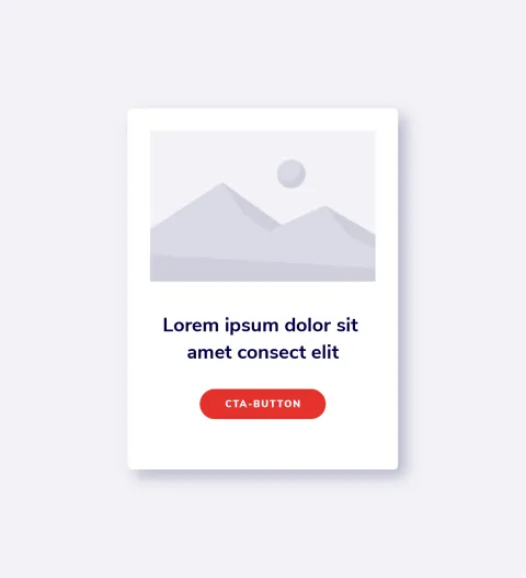
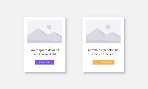
Let’s have an example: On a website you typically have overview pages that provide links to landing pages with the actual content. Think of a listing of products or services where the user clicks on the most suitable item. For these items you would typically use an ‘Image Text Card’. Such a card could be assembled by using a ‘Squared Image’, ‘Regular Text’, and a ‘Standard Button’.
As can be seen above, the design language that all stakeholders have agreed on contains:
- ‘Image Text Card’,
- ‘Squared Image’,
- ‘Regular Text’, and
- ‘Standard Button’.
This methodology would be used for all aspects of the corporate design.
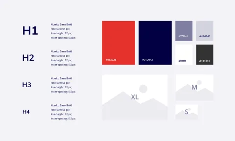
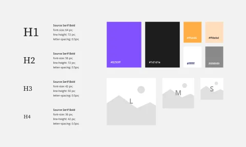
It is good practice to start with the smallest possible components such as colors, texts, headings, and images. Each must be named and have a clear definition of how it is used. Colors could be named as ‘Primary Color’, ‘Secondary Color’, ‘Danger Color’, etc. Fonts could be named as ‘Regular Text’, ‘Summary Text’, ‘Cited text’, ‘Eyebrow Text’, ‘Link Text’ etc. Headings would typically be organized as ‘1st Level Heading’, ‘2nd Level Heading’, ‘3rd Level Heading’, etc. Images would be organized as ‘Squared Image’, ‘Hero Image’, ‘Banner Image‘, Portrait Image’, etc. Starting with the smallest possible components is also referred to as Atomic Design.
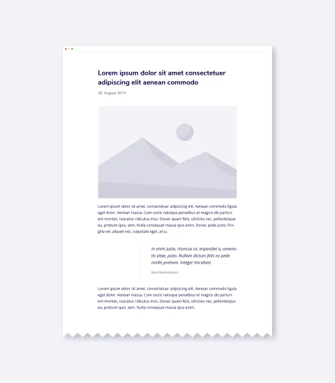
Components, as in the examples above, are then used, when the layout for a new page type is created, let’s say for a news article. Such an article typically consists of a ‘1st Level Heading’, a ‘Hero image’, an ‘Eyebrow text’, a ‘Summary Texts’, and ‘Regular Text’ combined with ‘Cited text’ and ‘Link Text’.
When working with a design system methodology an important aspect is having a concise design language. If all your components have sensible names it is easy for the stakeholders of the design system to communicate.
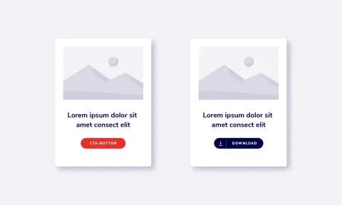
You could for example ask the designer to change the ‘Regular Button’ on the ‘Text Image Card’ to an ‘Icon Button’.
Making design systems available
A design system is typically made available with a web based application, that allows easy navigation of all components simulating different use cases.
Also such software makes templates available, that can be used by other software to use the components of the design system.
Popular examples of design systems are
- Google Material Design,
- IBM Carbon, and
- Salesforce Lightning Design System.
At 1xINTERNET we use Pattern Lab for creating an online design systems. We primarily develop with Drupal and React and have built our own set of tooling for creating decoupled frontends. As a starting point we have used the well established Particle theme.
The design patterns are made available as templates that can be integrated in other software. Hereby, the design system would typically supply the templates in the programming language needed by the different systems.
Working like this allows us to completely separate frontend development from the development of the actual websites. Once the frontend is ready and all components are made available with as templates, they are used by all websites.
With this approach the highest possible re-usability of frontend is achieved, and after initial creation cost, the development time of new websites can be significantly reduced.
A nice demo is provided by Patternlab.
How do you handle different designs?
Often large organizations have different designs. Sometimes they have different brands, or the same brand is used differently for varying audiences. Such audiences could be students, adults, or pensioners, who are best reached with different communication.
Different designs could be different logos, fonts, colors, etc. But they could also include completely different interaction components like fancy sliders, or traditional accordions.
Depending on the use case such designs could be integrated into the standard design system. The number of available sliders could be increased, and it could be agreed that usage of certain sliders is only allowed for certain use cases.
Alternatively, a variant of the design system could be created. Here fonts and colors could be changed, the majority of components could be integrated from the main design system could be used, some components could be excluded, and other components could be added.
The application of different designs in web projects works the same and with one design system.
Testing component based designs
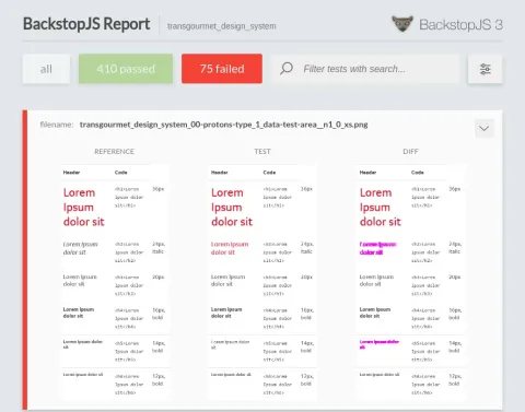
An important aspect of component based designs, is that they can easily be tested.
All components of a system are developed for different screen resolutions, work for touch- and non-touch screens, are optimized for accessibility, and are optimized for the best possible user experience.
In such a system all components can be tested individually with a variety of testing tools. We always use Visual Regression testing during quality assurance, to analyze what components are affected by the changes.
How to share design systems across implementation teams
Given that you have created a design system and made it available for users to work with it, the question arises, how this is actually done.
Imagine a scenario in which you have a standardized CMS technology such as Drupal in your organization. Frontend in Drupal is created with so-called Twig templates. Twig is a flexible templating engine for PHP.
These templates can simply be included in your CMS. Technically speaking, the CMS would include the Twig templates from the design system and parametrize these with the content generated by the CMS.
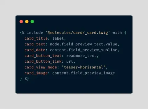
Staying within the example above for generating a news article, the CMS would call the template for ‘1st Level Headline’ to display the headline, the template for ‘Hero Image’ to display the image, etc.
A good way to integrate your design system into a website project is to make it available as a regular source code dependency. That way when all dependencies of the website are updated, the design system is also updated, and the newer version is automatically included in the next version of your website. This is especially useful to automatically roll out extensions, updates, or changes of your design system to all websites.
Let’s have an example. Say, you discover that the component ‘Cited Text’ does not comply with WCAG 2.1. standards for web accessibility, the design team is asked to provide an updated visual design. Then the frontend developers update the component with new styles and supply a new template. Once the new design system is tested a new version is created. As soon as the websites using ‘Cited Text’ are updated, the new version of cited text is rolled out.
When to use Patternlab
We primarily use Drupal and React for building websites. The technology we use for creating design systems is Patternlab (see above).
For both we provide templates. For Drupal we provide Twig templates, for React we provide JSX templates for the different React components.
Patternlab can be extended to also ship other types of templates (Angular, Vue, etc.). The question of whether Patternlab should be used to build up a design system depends on the technology being used in the website projects.
For building standalone JS based applications Storybook is a great tool for developing UI components.
Other highlights
Collaborative workflow between designers and developers

The collaboration between designers and developers is an essential factor for the success of any web...
Atomic Design: Consistency that pays off

Web design has changed significantly in recent years. In the past all pages of a website were...