Combining CSS box-shadow and clip-path to create complex shadow shapes
I recently worked on a web project which features a dropdown. As per the instructions of the designer/client this dropdown was supposed to have an unusual drop shadow around both the dropdown button and the dropdown content area. After some initial research I was able to solve the problem by using a combination of the CSS box-shadow and clip-path properties. This is just one example how CSS can be used to create complex and subtle interfaces by using very simple building blocks.
The challenge
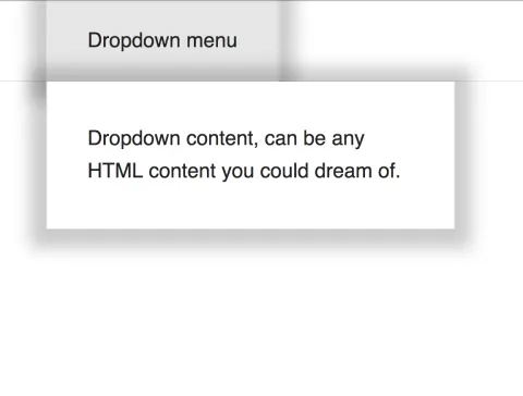
The design for the dropdown included shadows for the button and the dropdown content (when the dropdown is opened). These shadows should not cover each other and should fit seamlessly together to create the impression of one connected elevated element. (Of course, this is not how shadows behave in the real world. But this isn't intended to be an exercise in realism)
To create the shadows we will use the CSS property box-shadow. In order to prevent the box-shadow shadow boxes from covering each other, we will use the clip-path
Box-Shadow
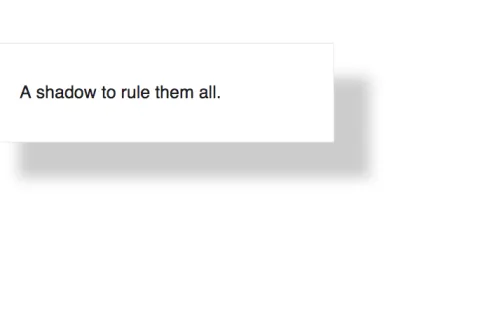
The CSS box-shadow property makes it possible to define a shadow for a rectangle (objects are always painted as rectangles on web pages unless they are clipped or masked*). As you can see from the specification it is very flexible:
box-shadow: none|h-offset v-offset blur spread color |inset|initial|inherit;
It is also possible to define several box shadows by separating them with commas.
The box-shadow property is extremely powerful. Unfortunately, it is limited to styling the shadow box uniformly. For instance, it is not possible to define blur gradients or custom shadow forms.
* This is for another day and another article.
Clip-path
This CSS property exposes an API to clip (= hide everything outside of X) an object. The API is even more comprehensive than box-shadow so instead of rambling on I will just defer to the mozilla dev docs on this.
For now, the part of the API we are interested in is the ability to define a polygon as a clip-path.
clip-path: polygon(50% 0%, 100% 50%, 50% 100%, 0% 50%);
Basically, within the parentheses, we write a series of x and y coordinates (they can be pixels or any other CSS unit, but for the purposes of this article we will stick with percentual values which are relative to the size of the element) separated by commas. Though they can be written in any direction I prefer to always write them starting in the upper left-hand corner going clockwise. The polygon "closes" itself automatically between the last and first pair of values.

The solution
This is a very bare-bones example. The original screen design and solution looked much more like a proper dropdown. Also, this solution uses a combination of the :focus pseudo selector and the sibling selector (~) to create a very simple dropdown. This isn't overly accessible (aria-attributes and proper labeling are missing) but serves the purpose of this CSS-only demo.
There are two selectors with box-shadow: .dropdown__button and .dropdown__content. In order to prevent the shadows from covering each other we define a clip-path property on both of them:
- We do not want the
box-shadowof the button to go beneath the bottom of the button element. For this purpose we writeclip-path: polygon(-50% -50%, 150% -50%, 150% 100%, -50% 100%). In order for the box-shadow to actually show on all the other sides we include a 50% extra margin on each side. - Conversely, we do not want the opposite for the content element: Its shadow should not go over the upper edge of this element. The corresponding style definition is:
clip-path: polygon(-50% 0, 150% 0, 150% 150%, -50% 150%)
HTML markup
<div class="header header-height">

  <div class="container">

    <div class="dropdown">

      <button class="dropdown__button header-height">Dropdown menu</button>

      <div class="dropdown__content" aria-hidden="true">Dropdown content, can be any HTML content you could dream of.</div>

    </div>

  </div>

</div>
CSS styles
/*

  Use CSS variables because we can and this code formatter breaks on SCSS.

  See: https://developer.mozilla.org/en-US/docs/Web/CSS/Using_CSS_variables

*/

:root {

  --headerHeight: 4em,

  --background: #fff,

  --boxShadow: 0px 3px 30px 20px rgba(0,0,0,0.2),

  --border: 1px solid #e7e7e7,

  --padding: 2em

}
/*
These styles are just basic styling and don't really have anything to do with the article.
*/
* {
box-sizing: border-box;
}
body,
button {
font-family: sans-serif;
color: #222;
font-size: 25px;
line-height: 1.6em;
appearance: none;
background: var(--background);
}
button {
padding-left: var(--padding);
padding-right: var(--padding);
border: var(--border);
}
.container {
max-width: 20em;
margin: 0 auto;
}
.header-height {
height: var(--header-height);
}
.header {
position: absolute;
top: 0;
right: 0;
left: 0;
border-bottom: var(--border);
}
/*
Now come the dropdown specific styles …
*/
.dropdown {
/* Necessary for the positioning of the dropdown content. */
position: relative;
}
.dropdown__button:focus {
outline: none;
background: #eee;
/*
Apply a box shadow and clip the element to a box 50% larger than the element on each side,
except at the bottom. There the clipping area should be exactly at the y offset of the bottom border.
*/
box-shadow: var(--boxShadow);
clip-path: polygon(-50% -50%, 150% -50%, 150% 100%, -50% 100%)
}
.dropdown__content {
display: none;
padding: var(--padding);
background: var(--background);
border: var(--border);
border-top-width: 0;
position: absolute;
left: 0;
width: 20em;
/* Same as with the button just that here the cropped side is the top. */
box-shadow: var(--box-shadow);
clip-path: polygon(-50% 0, 150% 0, 150% 150%, -50% 150%)
}
/*
Simple dropdown functionality: Show the sibling of the dropdown button which is focused.
*/
.dropdown__button:focus ~ .dropdown__content {
display: block;
}